
EVAN
SANCHEZ
The Gondola - 2025
QGIS, Adobe Illustrator, Excel

Election Mapping - 2025
QGIS, Adobe Illustrator, Excel
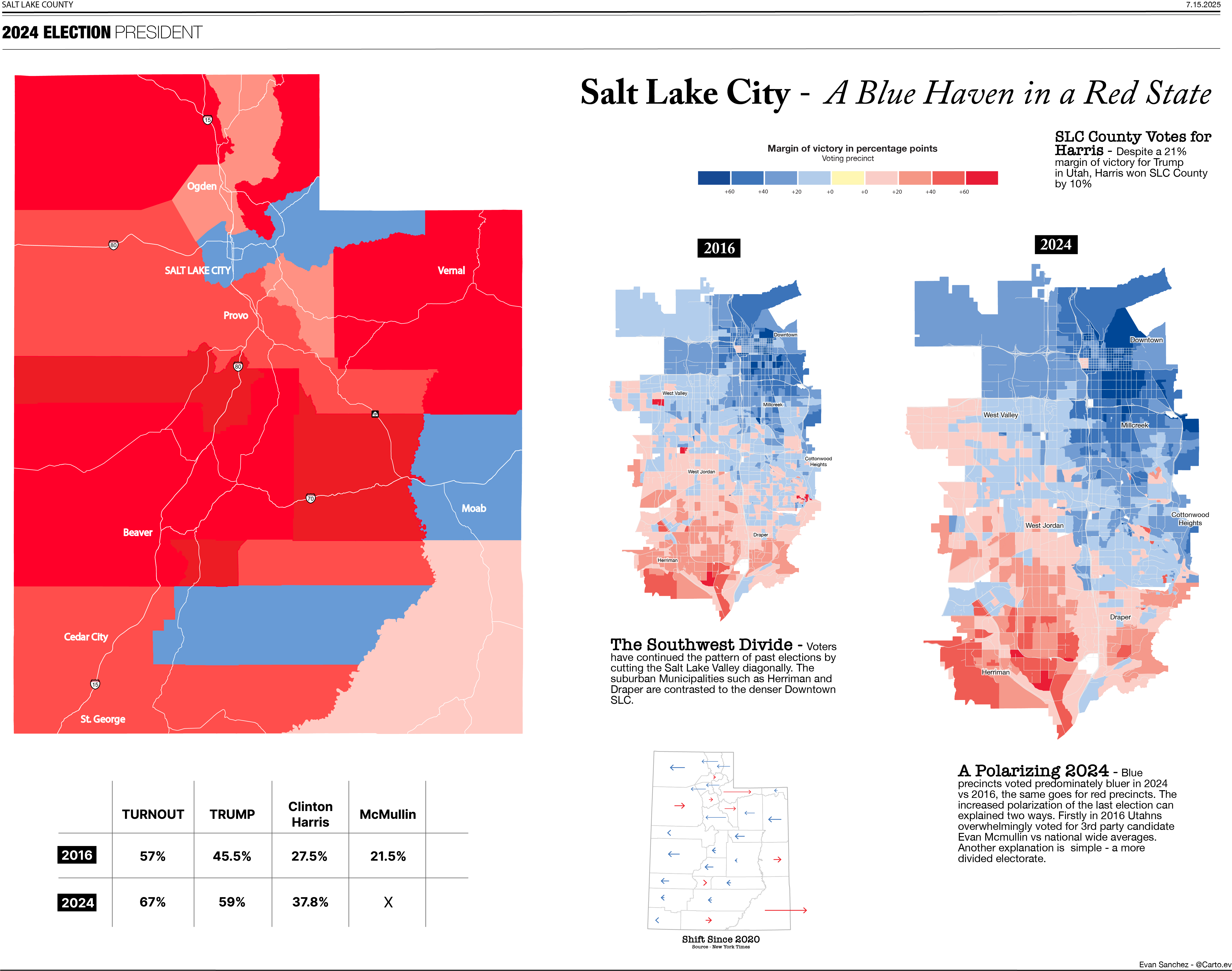
This project visualizes the political geography of Utah and Salt Lake City during the 2024 U.S. presidential election. County and precinct-level maps highlight the stark urban–rural divide, showing Salt Lake City as a Democratic enclave in an otherwise Republican state.
The Great Salt Lake - 2025
QGIS, Adobe Illustrator, Excel
This map illustrates the dramatic decline of the Great Salt Lake, which in August 2025 reached its lowest recorded level. The map combines shaded relief with hydrological datasets to compare historical extents (1984, average, 2024) against the current shoreline. A timeline chart beneath the map contextualizes the lake's fall relative to historical averages, presenting both geographic and temporal dimensions of the crisis.

Interactive Web Maps - 2024
ArcGIS Online, JavaScript, HTML/CSS
Created dashboards that tracked disaster impacts in real time. This Hurricane Milton tracker integrated live weather data, employee location tracking, and business impact assessments to support emergency response coordination across multiple insurance companies in Florida during the 2024 hurricane season.

Unified Health - 2025
Power BI, SQL Server, ArcGIS
To support lead management and enrollment tracking at Unified Health, I designed interactive dashboards and geographic maps that visualize call center performance, Medicare Advantage enrollment trends, and LIS/SEP eligibility patterns. These dashboards integrate large-scale lead data with FIPS-level geography, enabling teams to filter by state, county, and product type. Automated SQL pipelines ensure daily refresh, while spatial layers highlight enrollment distribution and market opportunities.


